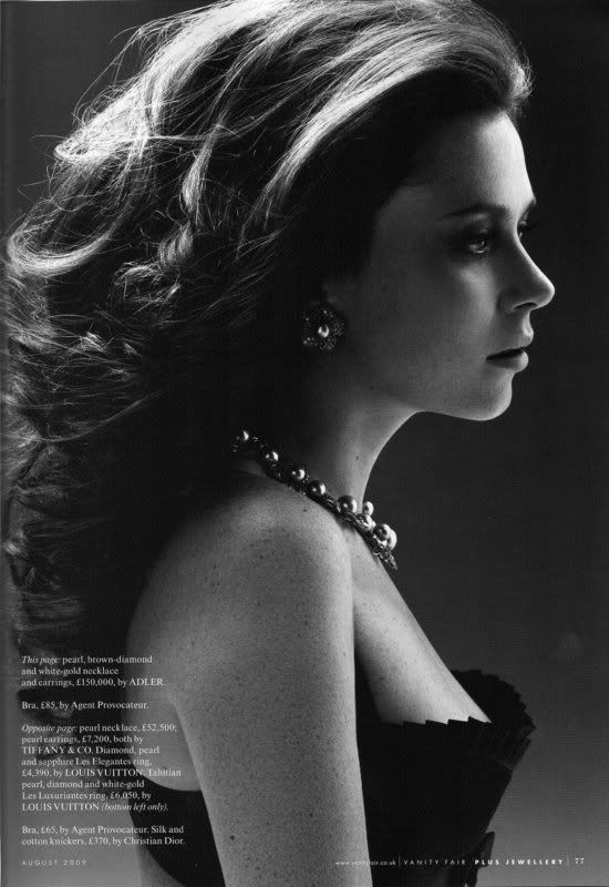
I was looking through some editorials online the other day and came across this photo:

I was speechless. *Jaw dropped to the floor*Amazed*
Model: Anna Friel
Photographed by: Kai Z. Feng
Magazine: UK Vanity Fair, August 2009
Editorial: Pearls on Film
Click HERE to see the rest of the editorial
I know the picture looks very simple, especially that it's in black & white. I bet to you it looks like any other picture you've seen in a magazine. But I don't know, for me, this picture is simply amazing. The lighting is just perfect/brilliant. Stunning in its simplicity. I don't think I've ever seen lighting like this for a profile. The lighting on this profile is just something you don't normally see or expect. I'm just amazed by the technical genius of it. Look how the shadow forms on her face and how the light falls so softly on her chest. And not to forget the hair light on top. Who would've thought of doing a lighting set up like that for a profile. I'm sure I wouldn't have been able to, at least not anytime soon. I think I'm going to try to replicate this in my upcoming shoot real soon. Keep posted!
:)


No comments:
Post a Comment