(Super duper late post)
One of the things I was busy with last term was creating a mock magazine for one of my major subjects. It was a group project which served as our finals. I was the managing editor. My task was to design the magazine, make sure people submitted their articles on time, edit their articles, and etc. We called our magazine BREAK. Break in every sense of the word. Taking a BREAK, BREAK away, BREAK free, BREAK time, BREAKfast, you get the point. That's the message we wanted to convey with our magazine, what we wanted our magazine to represent.
The making of the magazine:
Top 3 (EIC, Managing Editor - not in pic, taking the photo, Associate Editor) Meeting
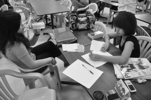
Associate Editor, Marika Callangan oF Projectrika.blogspot.com
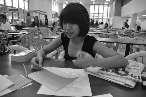
EIC, Pilar Almario of thepilarness.blogspot.com and I
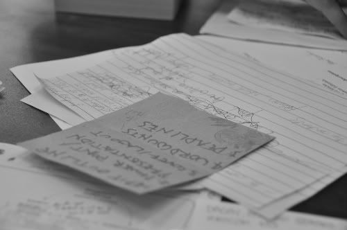
To Do List
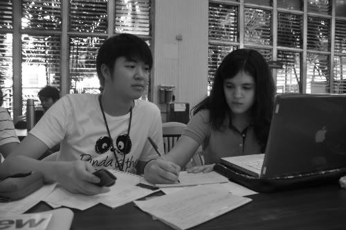
Group Meeting
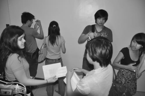
In Class
Below are some of the pages I designed for the magazine. I designed about half of the magazine while another groupmate designed the other half. This is the first time I designed a magazine and I'd have to say, I think I did a pretty good job. Don't you think so?

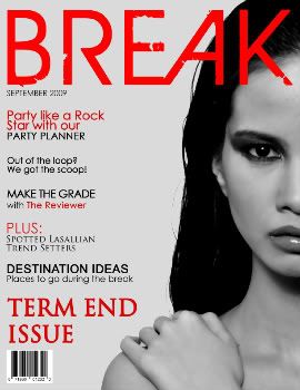
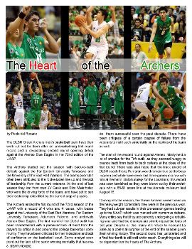
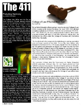
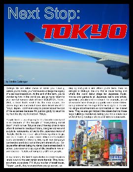
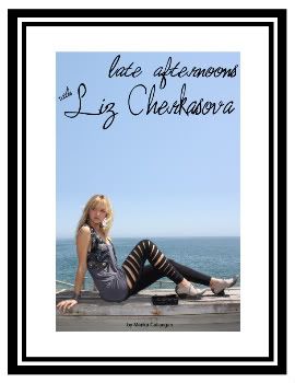
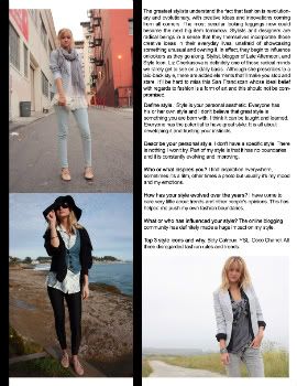
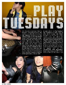
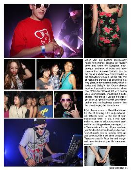
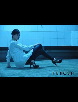
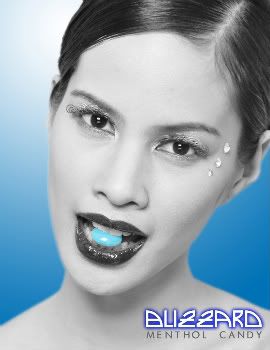


BREAK = beautiful. im so proud of it.
ReplyDeletei think i look sexy in action. KIDDING. Good job andrew! looking forward to working on more projects with you! :)